Simply Customize It 1.1.0: Following the Thread

Simply Customize It hasn't had an update since March 26, 2026. Not because nothing was happening, but because I kept doing the kind of work that feels more like maintenance than a moment. Accessibility passes. Code audits. Small things that grated at me. I kept waiting for a bug to be reported to push everything to the App Store... then at some point I realized I should update the App Store, that needed a new build, and I realized just how much had quietly accumulated... and then worked a bit longer on one more thing first.
What Changed
App Store Data
Although not shown in the app I finally updated the App Store images for iPhone, iPad, and the Mac along with removing the out of date video. Hopefully this helps on first downloads so the old information doesn't conflate with the newer app.
Onboarding... Simplified
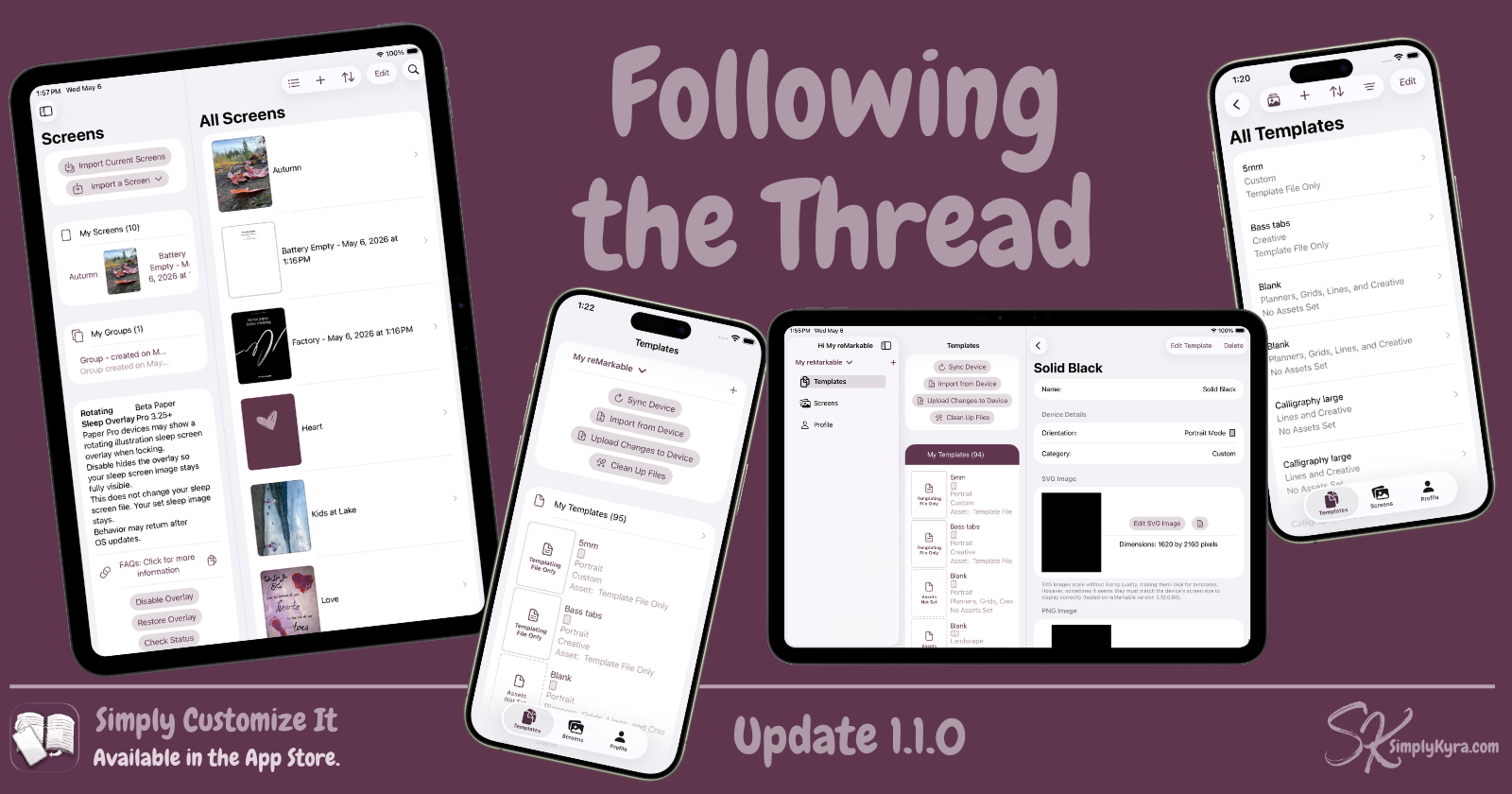
The onboarding flow in Simply Customize It used to be eight steps. It's now five.
I had started noticing how much heavier onboarding felt than it needed to be. Two similar sections were combined while a few others that weren't pulling their weight got removed. The result isn't dramatically different, but it does move a bit faster, and that matters when someone is trying to get their reMarkable set up.
Settings and Accent Colors
While working on other ideas I'd updated some shared code. I figured with the update planned why not hook up the new accent color section in settings and that, while looking over everything with fresh eyes, led me back to redesigning the profile settings. This was a back and forth process that led to the next section which led to let's make it optional and/or add ways to auto-select on load.
Browse... Your Way
While playing with the color scheme and accent colors I realized the placeholder for the templates without a PNG or SVG image may look out of place. So I redesigned them to be a drawn document style using the accent color so they could tie in better with your aesthetics. Then I missed the original asset and made it accessible via a toggle in settings.
From there I realized most of my templates were default and I might not want the images to show sometimes. So from there both the templates and screen browse list gained a button to switch between showing and hiding the images. This also became a toggle in settings.
Then I noticed when browsing screens in the group display or templates in the category display maybe the images should be optional there too. I added the button but decided to skip the settings there. Let me know if you want that added.
And Many Others
During this whole process I kept finding other minor issues that surfaced including a subscription button that wasn't behaving, accent colors that weren't propagating correctly, some off-center text, and a banner that wasn't tapping through correctly. Some such stuff that came together over the course of this update includes:
- Filtering and sorting in the browse view now remembers how you had it set as you move in and out, rather than resetting each time... if you close the app it will go back to defaults
- The new template and current screen display adjusts correctly based on device size
- SVGs were appearing landscape instead of portrait in some contexts which is now fixed
- The about page was updated to match the current shared project style
reMarkable Paper Pure
While finishing up the update the reMarkable Paper Pure was announced (today based on when I started typing this). I already own the reMarkable 2, then Paper Pro, and finally the Paper Pro Move so I could test this app. That said, based on the specs I'm thinking it's going to be similar to the reMarkable 2 (screen dimensions and black/white) but maybe be more Paper Pro in OS. As such I don't currently plan to get one.
That said, I'm not ignoring it. I'm not sure when all of you will start buying and/or receiving them but I plan to support it for now. This morning I added the Paper Pure to the device list using the Paper Pro screen types and the reMarkable 2 screen sizing as a starting reference. If you use it every section device specific includes a note reminding you that it hasn't been tested with an actual device and shows a link so it's easy to reach out if something looks off. If you have one and find anything that needs adjusting, please let me know.
If you don't have one nothing will change for you beyond seeing a new device added to which device type you have when editing it.
As always, if anything feels off or you notice something I missed, I'd love to hear from you. You can reach me through the app or over at the App Store.
As always, thank you for the emails, messages, and quiet hey, something feels off here notes... they genuinely help make the app better.
Until next time, Kyra 💕
Did this save you time?