
Sketching, Composing, and… Failing? My App Icon Experience with Apple’s New Tool Icon Composer

I was excited to see the new designs Apple came up with during WWDC 2025 this week along with all the related updates. As such I loved the idea of the new Icon Composer tool and immediately downloaded it to try out. I figured this would be the perfect low-pressure, artsy task I could enjoy away while absorbing all the session videos. Plus this way I knew I'd have the added benefit of being ready for my apps next update while showing that I'm actively keeping on top of the new technology.
Heads up is it working? Unfortunately, looking online it's suggested that this may not fully work unless you install the new macOS beta Tahoe. That said, I've also heard of people who are on the App Store upload difficulty step (they got further than me) so whether this works for you, you're planning ahead, or an update fully fixed the process I wanted to share what I did and how far I got in case it helps you.
Quick aside: If you haven't seen it yet and are curious what's coming out with Apple here's the keynote talk from Monday (June 9th, 2025):
Embedded the WWDC 2025 keynote video from YouTube.
Updates
UPDATE (less than an hour later):
I found an update on the Apple Developer Forum! Apparently, instead of exporting from Icon Composer, you need to drag the saved file directly into Xcode.
UPDATE (next morning - June 12th, 2025):
Wanted to expand a bit now that I’ve had time to test more.
- Make sure you’re running Xcode 26 beta.
- Locate the saved Icon Composer file (not exported images)
- Drag and drop it into your Xcode project. It will have you set the target.
- Rename the asset to match your expected AppIcon name in App Icons and Launch Screen
With this setup, the icon now builds and runs on my iPad (beta 26), but it doesn’t change appearance in dark mode. It runs on macOS Sequoia but the background of the app icon shows up as white instead of my chosen purple.
For now, I’m rolling back the changes and planning to reassess before my next app update.
UPDATE (next afternoon - June 12th, 2025):
Don't forget if the new icon isn't showing up on your Mac... clean the build before continuing. That helped me yesterday.
Anyway jumping on as this question on the Apple Developer forums looks helpful if and when you start wanting to combine new with old.
UPDATE (June 13th, 2025):
I open all my current projects in Xcode 26, uploaded the icon file, renamed it to AppIcon, and checked off App Icons Source in the target section. Compiling and running them showed the old app icon on my Mac and the new one on my iPad. That said the icons didn't change when switching my Mac to dark mode.
Closing the project, reopening with my current Xcode (16.3: 16E140), and running it again on the iPad 26 showed the old app icon.
UPDATE (June 25th, 2025):
Thanks to the helpful reply here’s a link to the Apple docs with a much better how to.
Current Setup and Knowledge
Before continuing I wanted to share my current setup, in case this affects you, and link to Icon Composer, its current WWDC videos, and the relevant Human Interface Guidelines.
My Setup
- Icon Composer: version 1.0 (27.4)
- Only let me export
PNGfiles so I'm assuming I should've stopped there.
- Only let me export
- macOS Sequoia: Version 15.5 (24F74)
- Didn't want to run the beta on my main computer just in case...
- Xcode: Version 26.0 beta (17A5241e)
- Opened up my current active project: Simply Customize It
- I was targeting:
- My current non-beta iPhone (18.5) and MacBook (15.5)
- An old but recently updated beta iPad (26.0)
- Downloaded the iOS 26 simulators but they didn't appear (only iOS 17 and 18) in the dropdown
Information: Icon Composer
Information: App Icons

My Results
In the end I revamped the app icons for all three of my published apps (Simply Customize It, Simply Match It, and Simply Uncover It) along with two other apps: Simply Command It, whose development is currently paused, and an upcoming app I'm currently working on.
PNG) after some time with Icon Composer.I've separated out the steps below but just so you know this wasn't quite as simple. Instead it was repeated process where I exported my images, checked it out in Icon Composer, updated my images to fix something, exported, and repeated until I decided it was good enough.
Image Prep
Most of my app icons had been created using my reMarkable before uploading them to my computer where I played with Pixelmator Pro to make the colors better. My process normally included drawing individual smaller pieces before combining them on a new page thus making the final exportable image. Icon Composer is just fine taking only a single image to create the icon but I wanted to make use of the layers and since I used this piece-meal approach I was able to use each individual page as a unique layer in Icon Composer.
It wasn't as simple as it sounds as I found with the first upload that the images still needed prep work by coloring them in (the transparent phone was a bit much). On top of this although that was my normal process some app icons were just a single image that needed to broken down while another didn't use the reMarkable at all and was instead created in Canva. As such I split them up below and I'd love to hear in the comments below which way (or a completely different one) you prefer!
reMarkable Device: Prepping an Image
I started with my main app, Simply Customize It, as that's the one that currently feels the most important. After finding the images on my reMarkable I copied them into my current sketchbook making a single page for each proposed element. What followed next was a repetitive process as I exported the images to my computer, added them to Icon Composer, and then went back to fix aspects of the images on my reMarkable.
SVG files and was ready to try again. Heads up rotation: at this time there's no rotation in Icon Composer as it seems to only have the x and y coordinates and the sizing percentage. As such you may need to rotate your image(s) at this point before exporting them to your computer and adding them to the Icon Composer.
Heads up differing elements: if you want to move two elements on a layer in different directions (examples: the arrows pointing to the phone in this app icon) move them to their own images. This way they can be moved independently from each other and if you combine them in a single group (the folder) in Icon Composer they seem to be in a single layer and have shared layer settings too.
reMarkable Device: How to break up an image
The above example was made up of individual images but my lightbulb app icon for my stalled Simply Command It app was sketched on a single page with a single layer. In this case I used the select option to manually select sections, cut that sections piece of the image off, and go on to paste it in a new layer. I chose this technique so I could line the image sections up better over the layers as if I had instead gone to a new page for each layer like before I would need to play with differing coordinates in Icon Composer later. That said, I still ended up with a page for each layer in the end as once the image was separated into layers I duplicated the page so and simply hide the non-active layers for each one. Thus a page for each layer.
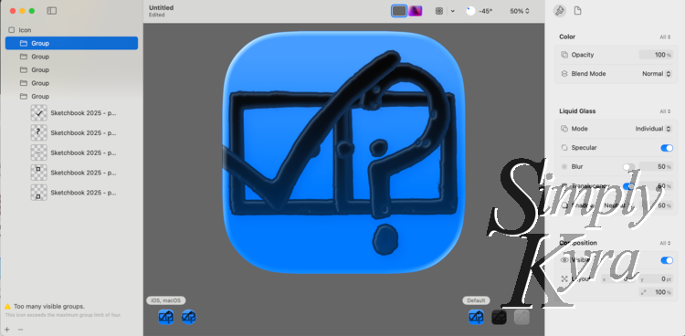
Heads up layer count: not sure if it's temporary or permanent but you can only have 4 groups (layers) in Icon Composer right now. Once you add a fifth folder you get a warning at the bottom of the pane (see image under Icon Composer Design Process for warning). That said, you can have multiple images in each group. Haven't tested if there's a limit to those too yet.
Canva and Pixelmator Pro
My Simply Uncover It app icon was different as I started using the reMarkable to design it before realizing it would be much simpler in Canva. Here I copied the app icon image (kept an original backup) then added pages (copying and pasting the contents for each) so I had one for each layer before going back and removing the elements I didn't need so each page was unique.
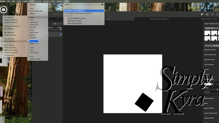
At this point if I had pro I could've exported the images with a transparent background but I don't so I loaded it into Pixelmator Pro and used the quick selection tool to highlight and delete the white background parts.
Heads up SVG Exporting: I am not a Pixelmator Pro power user and after exporting and adding the images to Icon Composer I realized they weren't showing up. According to chatGPT it's because my file has only one raster-based layer (for each image I was exporting) which Pixelmator Pro can't convert into a vector shape. As such this and only this app icon uses PNG images and looks a bit different in the final app icon image. That said, apparently you can use either for Icon Composer. Win, lose, who knows!
Icon Composer Design Process
Once the images were ready I imported them into Icon Composer for layout, scaling, and previewing. Here I simply dragged and dropped my images in, used the plus at the bottom to add groups, moved the images into their group, and rearranged the sorting to make sense with the layers as needed. I was able to click the group to change the Liquid Glass settings and click each image (later found out you can select multiple) to change their size and location.
What Icon Composer Did Well
I loved that you could see how the app icon looks after any adjustment allowing you to play with the layers and settings with immediate feedback. Switching between the square (for iOS and macOS) and circular watchOS version made it easy to make sure neither icon was too cut off or too not. Near the end I realized I could select multiple images at a time so I could update the settings in one fell swoop making it even quicker.
Where Icon Composer Broke
At this time I can only see how to export PNG images. That’s it. No icon, .iconset, .appiconset, or asset catalog to drop into Xcode. That said, if you only want PNG images it does allow you to set which one you want (single download) or you can download all the variants in one go which was helpful. I'm assuming this was my issue as since writing this I've heard other people mention a resulting icon file. That said I ignored this lack at the time and next had my...
Xcode Issues
I was excited to see how these newly design app icons looked but when I tried loading the exported PNG files into the Xcode Beta… things didn’t go quite as expected.
I’ve tried dropping one or all the resulting PNG images into my existing AppIcon, replacing individual slots manually, or just dragging the PNG into the assets. In all cases I renamed my current test to the old name with the prior app icon renamed to AppIcon-old. My app was able to compile and run on my computer (Sequoia 15.5) but the app icon shown was blank and when run against my iPad (beta 26.0) or phone (iOS 18.5) I got the following error:
None of the input catalogs contained a matching stickers icon set, app icon set, or icon stack named 'AppIcon'.
Going Forward
I've heard of people online having issues with uploading the apps to App Store Connect which suggests there is a way to go from Icon Composer to a working app... but since there's no way to push the update I'm going to hold off on working on this for now and am rolling back my project changes.
That said I plan to keep an eye out on the developer forums and coding-related groups while keeping my current Icon Composer files ready for when I try again. It's an early beta and I'm hoping there will be an update or a good plan going forward soon. And when there is I'll be sure to update this post for you!
If I missed a session or there’s a workaround you’ve found, please drop a comment or email me... I’d love to update this post with a working solution!
Wrap Up
While Icon Composer makes designing app icons visually easier than ever, there seems to be limitations that makes it impossible to update your app with a design appropriate app icon... so far. I’m still glad I explored it early and redesigned my icons and I’m hopeful an update will soon make this workflow fully functional.
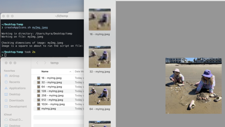
If you’ve hit this issue or solved it, let me know! And if you’re curious about the old icon system I've previously shared how I went from one large image to all the images needed with scripting!
I hope you have a great week and happy icon designing!
If you’re interested in getting any of my future blog updates I normally share them to my Facebook page and Instagram account. You’re also more than welcome to join my email list located right under the search bar or underneath this post.
Did this save you time?