
Simply Match It Update: Curved Corners and Calm Confidence

When I first launched Simply Match It, I wanted it to feel fun, colorful, and intuitive... something you could pick up and play with your kids or challenge your friends to a quick emoji showdown.
This week’s update isn’t a huge overhaul, but it brings a few thoughtful improvements I wanted to share. As always, your feedback and your gameplay experiences continue to shape how this app grows.
Why I Removed the App Icons (Even Without a Bug)
Both Simply Customize It and Simply Remember It ran into an issue where the app would crash when the app icon was displayed inside the app. I never experienced this problem with Simply Match It or Simply Uncover It (and no one reached out about it), but I didn’t want to take any chances.
Especially if it could affect your experience.
So I decided to remove the app icon from in-app use altogether.
It was one of those just in case changes that felt worth doing now rather than risking problems later.
Side Note: “Break the Score” Stress Test
(Thanks Zoey!)
While testing the update, my youngest jumped in to help when we had a few minutes to kill before school. Her self-assigned mission? Try to get to a –100 score on the iPad version and see if the game would crash.
Spoiler: it didn’t.
So if you’ve ever wondered whether the score system can handle wildly negative numbers… now we know.
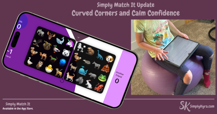
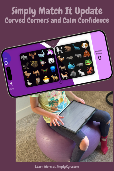
Game Play for 3 and 4 Player Games
The rectangular animation that appeared when playing from a corner button (used by all players in 4-player mode and two of the three players in 3-player mode) always bugged me a bit. So I took the opportunity to smooth it out.
Now, the visual timer animation has a curved edge that better matches the button it’s coming from.
The gameplay logic hasn’t changed—but now the visual transition feels smoother and more in sync with the rest of the design.
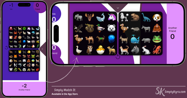
Clearer Button Text (Across All Player Colors)
Another small improvement: I adjusted the text color on player buttons so it’s easier to read, no matter what background color is used.
This was especially important in multiplayer games where each button has its own color.... and legibility matters when things get competitive.
Game Settings: Now With a Friendly Apply Button
The other small change was in the game settings screen.
Previously, changing a setting would immediately update your cards even if you were just looking around. Now, a new Apply button shows up only when you’ve made a change, and you get to choose when (or if) the game resets.
It’s a subtle update, but it gives you more control and helps avoid unintentional resets... especially helpful if you’re mid-game.
Try It Out
You can download Simply Match It on the App Store or update it if you already have it installed. And now I’m off to update Simply Uncover It to remove app icons there too... just in case.
But first, as always, I’d love to hear what you think! If you have any feedback, ideas, or bug reports, feel free to reach out in the comments below or email me directly.
Loving the game? Please consider leaving a quick App Store review to help more people discover it. It means so much to me as a solo developer.
And like always.... I hope you’re having a great day.
If you’re interested in getting any of my future blog updates I normally share them to my Facebook page and Instagram account. You’re also more than welcome to join my email list located right under the search bar or underneath this post.
Did this save you time?