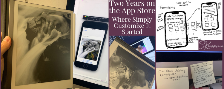
Two Years on the App Store: Where Simply Customize It Started

A month or so ago I was going though old photos and stumbled across a shared album called SimplyKyra Device App (a really great name huh).. and discovered several photos of Simply Customize It ranging mostly from October 2021 to June 2022. Looking through them was a weird sort of time capsule.
Once I started looking at dates I realized I didn't even release the app until May 2024 making these images two to three years pre-release... then I realized it's been almost two years in the App Store! Happy Birthday (now belated) to Simply Customize It!
Considering I'm currently now typing... with no photos decided and no plan... and it's already May 7th... and the bus alarm just went (let's pause) I don't think I'll make this post in time for Simply Customize It's birthday tomorrow. That said.. I may make it this month. So let's go!
Before It Went Live
Last year I shared a post on how a sleep screen image on my reMarkable sparked Simply Customize It... though it ignored the coding side of the project and instead focused on the reMarkable tutorial blog posts and how their feedback created this app.
If you want the general blog-side of the story check it out here! I just realized it was published about a year ago.
That said, there was a development side to the process where I took years getting up to speed on Apple development first with books, then 100 day challenges, and then finally purchased a membership with Hacking with Swift in November of 2021. That said, I'm not patient with long tutorials... and so quickly turned to what would become Simply Customize It first to see if it was possible and then later to share with you all.
Those found images made me realize I wanted to share this journey with you. A journey where I created ugly lists just to see if I could get SSH working, confirmed the SCP was possible, and then watched the new Apple announcements at WWDC just to rewrite the whole thing... this rewrite happened two or so times. But each time I rewrote I was able to take what I learned, combine it with what I now knew I wanted, and create something better kind of like a phoenix. Though eventually I realized I couldn't keep doing that... I wanted it in your hands.. and so I polished it up, created an LLC, and finally released it to the world.
Starting
The start was messy. It consisted of figuring out if the individual elements I needed to be successful to justify making this app could in fact be done. I created quick and ugly lists to easily navigate each puzzle piece as I built it. I hardcoded terms to speed up the testing. Muddled through trying to figure out how to connect to the reMarkable and luckily found Citadel (an API built around NIOSHH making it much more accessible) to both connect, execute commands, and transfer the images. I figured if I couldn't get this part working then the app itself wouldn't work and there was no point making it look pretty.
Getting Going
My earliest images I found were from July 2021... I'm assuming these were the result of a June WWDC let's start over session after that messy earlier start. Here I was still working on a main list backbone while testing the bare functionality letting me quickly add new test cases and pivot more quickly.
By this time my husband had bought himself a reMarkable 2 too so I realized that although all the reMarkable interactions needed to be connected to a single reMarkable... I (and you) might want to switch whose reMarkable it connects to. So I'd changed the main entry of the app... it depended on a user (a reMarkable) and, at this point, you could change the user from an optional list of people.
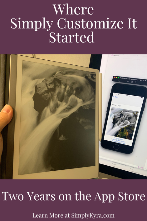
The Spark
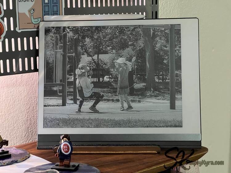
A full circle moment was being able to go from an image on the iphone simulator to that very image being on the reMarkable as a custom sleep screen image and seeing it there in black and white. The custom sleep screen was what made me first customize my reMarkable and now I could do it from a simulated app!

Plus this proved I could connect and transfer data from one to another. Next... more complicated things... like templates!
Planning the Next Steps
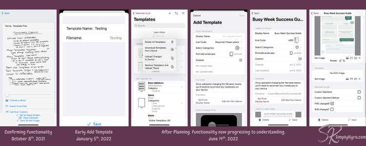
While coding this I'd sometimes need to take a moment, step back, and write out what I was thinking so I had a clearer vision when I went back to the computer. I found at the keyboard I'd get into the small minutia or be stuck in the big idea but miss the other side of it. This way I could take whatever started feeling fuzzy and jot it down so I didn't miss it later. Often it was raw steps, sometimes a simple todo note, and sometimes what I wanted the app to actually look like.
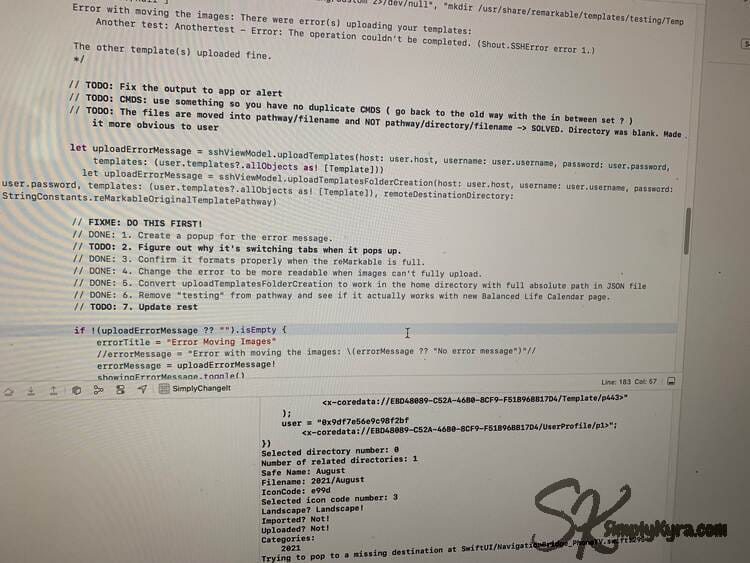
Instead of spending time making things look good for the user interface (UI) I'd instead confirm using quick print statements to write out what the computer knew and get a picture of what I had and needed to know to continue. Once I had that I then spend the time adding it to the UI, removing the print statements, and then make it look nicer.
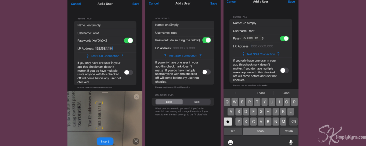
While coding I found myself manually typing in the connection credentials for my reMarkable so many times that I paused the main work to play with image processing and see if I could add something for both me while testing and for anyone in the future to get it filled out faster. It worked! And I added a photo to my iPhone simulator for quicker entry.
Redesigning
At least two or three times I virtually attend the yearly WWDC talks and decided, with all the new features, to completely redo my app.... starting fresh and manually moving over the code I still needed while building it up... again. These photos are from the redesign back in June of 2022 already showing bare bones of the future app coming through.
Letting Go
Not everything was constant growth. Several times I added in features both larger and smaller before deciding it worked best to remove.
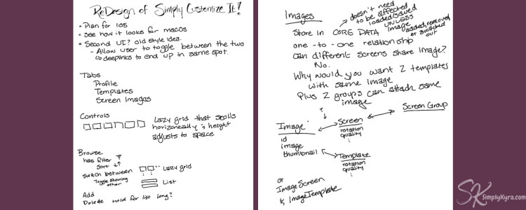
During this whole time I had a more complicated picture in my head on how templates would work. In addition to the categories (this was kept) I also pictured directories allowing people to dictate where their template's PNG images would be saved on their reMarkable. I also, while making the app, allowed the file name to be edited while also changing out the template's icon image.
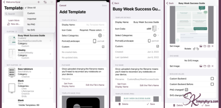
Before publishing Simply Customize It I realized just how complicated the process had become and so simplified it so the templates would be easier to edit and harder to mistakenly change their name and disconnect their reMarkable notebook pages. I also wanted to make sure everything was above board so I removed anything that might be considered proprietary leading to the blank icon codes that are now shown for the custom templates.
Other directions I chose to explore but didn't seem feasible to keep were:
Not all things removed stayed removed. One example are the SVG images that I was having trouble displaying at the time and thought we wouldn't need... in a future update I realized they were needed and added them back while also making them viewable and editable.
The Last Two Years
Two years ago I realized rather than continue the dance of fixing Simply Customize It up, watching WWDC, and then redoing it all again... I needed to simply publish it.
Over the years of developing the app I'd stopped using the manual way I'd been sharing in my blog posts and wanted to share this simpler way of updating the reMarkable rather than just the blog post themselves. I'd been feeling that way for a while... and so I distributed the iOS version of Simply Customize It on the App Store the second it was approved and then shared the macOS version eight days later. And then, just when I took a breath, the reMarkable Paper Pro was announced... and the updates began. With my Paper Pro purchased I was able to release an update that worked on both devices by October 15th. The following two years then consisted of updates responding to your emails (thank you), reMarkable updates, and fixing friction I noticed while using my app.
In case you're curious and want more I've linked the entire version history and the ever constantly updating FAQs.
A Look Back
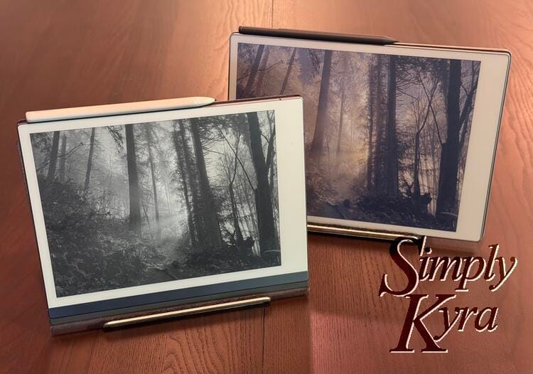
With each iteration I was able to pin down how Simply Customize It should look and simplified the app to make it, hopefully, easier to use. Looking back at all the images I realized it would be fun to compare the earlier 2021/2022 images with today's 2026 version.
App Entry
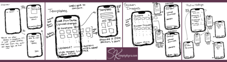
At the beginning I used lists to easily access each aspect of the app I wanted to get working. This changed over the years as I added more and it became more and more complicated.
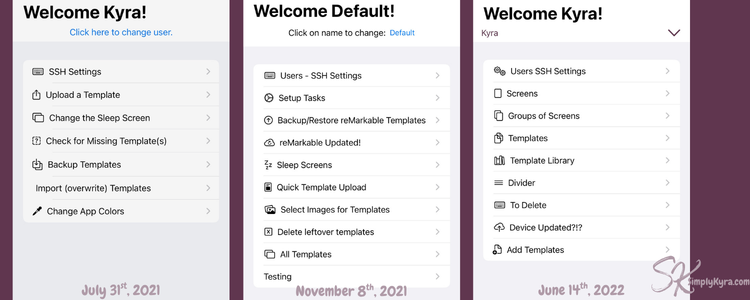
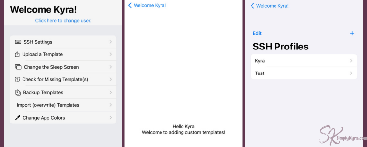
Now it's been split into three tabs: templates, screens, and profile (general settings).
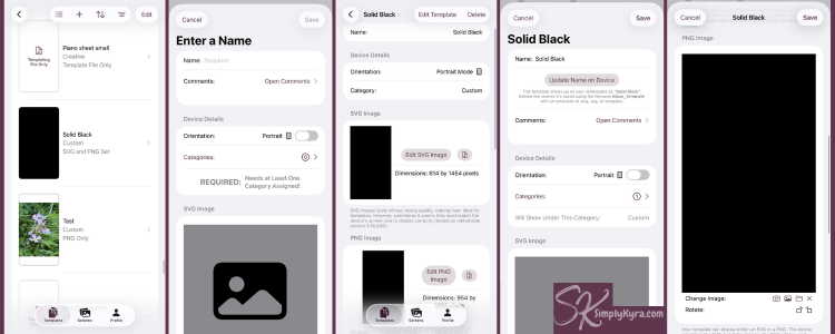
Templates
As mentioned above in Letting Go the template and the entire section used to be more complicated with directories that had been set up similarly to categories.
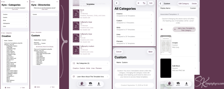
In addition the template display and editing system was more customizable but also way more complicated making it easier to mistakenly disconnect a custom templates from all the notebook pages it had been used in.
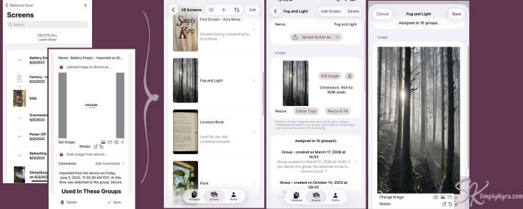
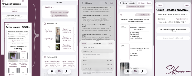
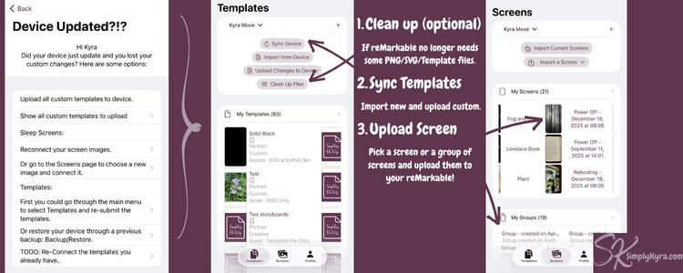
Screens
The screen process is simpler than the templates with simple download or upload from or to the reMarkable. That said, when designing Simply Customize It, several people were designing sets of screens at the same time and sharing them to Facebook. As such, both then and now, you can choose to work with individual screens or create groups of screens for quicker uploads.
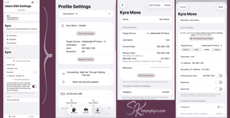
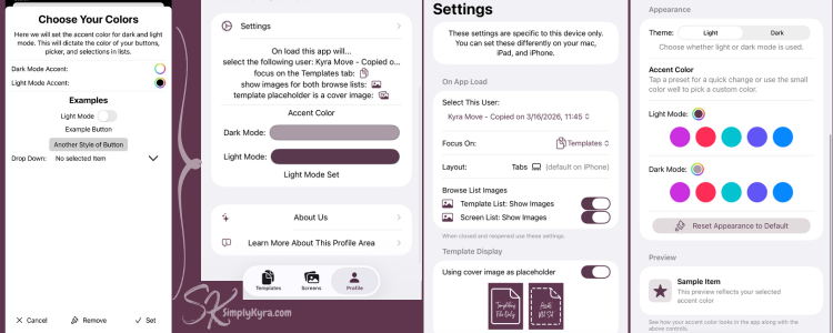
Profile & Settings
The profile area became both a place to see if the app is right for you while also offering customizations and tutorials. Here at the top you can see your devices (used to be called users), onboarding, new information, settings, and support.
And More
From the very beginning I added a learn more to the bottom of each tab explaining how that section all worked and linking back to my website if needed. The profile section also had an added onboarding and a bit more information for anyone needing it.
I loved stumbling across these photos that I forgot I took and loved being able to share them with all of you. I hope you enjoyed this story whether you've enjoyed Simply Customize It in the past, are now looking to check it out now, or are simply looking into other apps' journeys.
And, like always, I hope you’re truly having a great day!
I'm Kyra. An indie Apple developer and founder of SimplyKyra where I build calm tools that reduce mental load. If you want to check out all my Apple apps click here! If you’d like to keep up with future posts like this I usually share them on my Facebook page and Instagram account.
Plus, if you become a free member on the site you can sign up for my newsletters and join the conversation on any of my posts.
Did this save you time?