
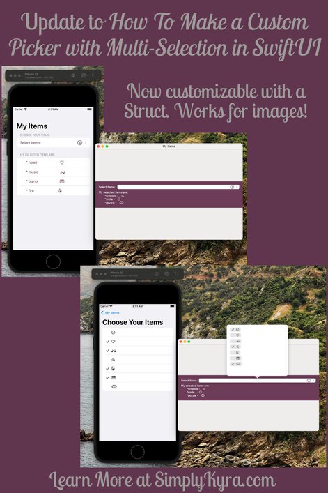
Update to "My Custom Picker With Multi-Selection in SwiftUI" - Now With Images!


Back in February I wrote a post titled How To Make a Custom Picker with Multi-Selection in SwiftUI where I explained how I created a custom controller, akin to a Picker, that allows the user to select multiple items at once. I’ve recently been emailed asking how one might be able to use images rather than text which led to me switching the String array used to a customizable Struct and I had to share the final code with you in case you’re also looking for something similar too.
I’m currently running Beta software and figured I’d share in case it affects your results. Specifically macOS Ventura (13.0 Beta) and, for Xcode, version 14.0 beta. Also, as before, any links, unless mentioned, will direct you to either my blog or the corresponding Apple Documentation page.
The Backstory
If you want the backstory on why I created this control, what sources I used to come up with it, a closer comparison between the iOS and macOS version, more screenshots, or even just a more in depth explanation of how to code it check out my previous post How To Make a Custom Picker with Multi-Selection in SwiftUI. Both the original code and the Struct updated version can be found on my SimplyKyraBlog GitHub repository. Specifically, the original code file is here while the updated file can be found here.
The Updated Code Explained
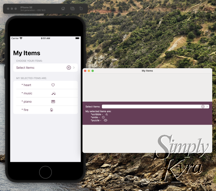
The update essentially takes the original String array and replaces it with a custom Struct. This way you can add whatever you want access to for the multi-selection picker. In my example I keep the Struct simple and include an Int id (to be identifiable), a String name (to display), and a String image name (to access a specific SF Symbol). I could see potentially displaying custom images by either using a String identifier name or using another type like Data or Image.
My custom Struct is:
struct myItem: Hashable, Identifiable {
    var id: Int
    var name:String
    var imageName:String
}
I next changed the selectedItems and allItems variables at the top of my ContentView to use this myItem Struct rather than the previous String. It now looks like:
@State var selectedItems = [myItem]()
@State var allItems:[myItem] = [
    myItem(id: 0, name: "smile", imageName: "face.smiling"),
    myItem(id: 1, name: "heart", imageName: "heart"),
    myItem(id: 2, name: "music", imageName: "music.quarternote.3"),
    myItem(id: 3, name: "scribble", imageName: "scribble"),
    myItem(id: 4, name: "fire", imageName: "flame"),
    myItem(id: 5, name: "piano", imageName: "pianokeys"),
    myItem(id: 6, name: "puzzle", imageName: "puzzlepiece"),
]
In the macOS and iOS Views I also updated the selectedItems and allItems to be a myItem array rather than a String array.
Surprisingly there weren’t many changes in MultiSelectPickerView. Other than switching the type of selectedItems and allItems I only needed to change the display code for each row while the action of the Button stayed the same. Specifically I went from Text(item) to Image(systemName: item.imageName).
The code to display my selected items, for debugging purposes, no longer compiled and took the longest to change but that wasn’t even that bad. Since this was a quick example I went simple and switched it to:
ForEach(selectedItems) { item in
    HStack {
        Text("\t*\(item.name) - ")
        Image(systemName: item.imageName)
    }
}
And with those minor changes you can now use SF Symbols, or whatever else you want, within your custom controller!
Struct can be accessed as it’s seeing the selectedItems array of the Struct itself.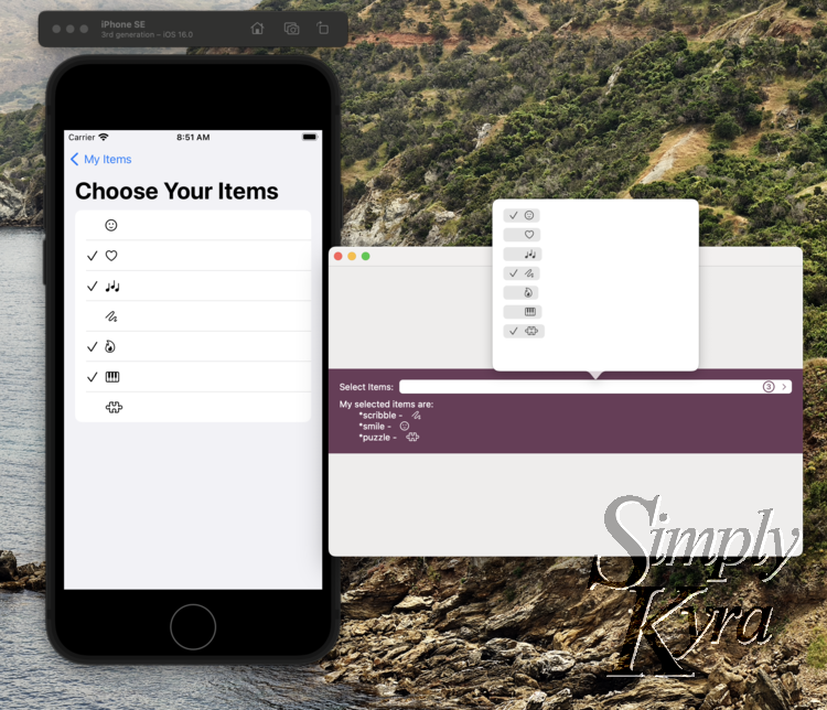
The Code Itself
If you want to implement this yourself I shared the code on GitHub here and also created a public Gist.
Fixed the Previous Issue
In my last post, under One Issue, I mentioned a problem with the layout when this control was used in a Form alongside other controls as their leading and trailing edges didn’t line up.
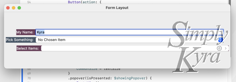
Form.Since upgrading to the new beta I’ve been able to try the new Grid control (iOS 16.0+ and macOS 13.0+) which completely solved this issue. I had asked this question and then subsequently answered it on StackOverflow, under SwiftUI MacOS Form Custom Layout, if you’re interested in a more detailed response.
Essentially I encircled the controls with a Grid and then each control was put in its own GridRow. All three GridRows had the modifier .gridCellColumns(3) added to it so they took the entire three column space. You could play around with the modifier for more custom requirements.
In case the StackOverflow question is ever removed I wanted to show the code used in the above example:
Grid {
    GridRow {
        TextField("My Name:", text: $myName, prompt: Text("What's your name?"))
        .foregroundColor(.white)
        .background(Color(red: 0.4192, green: 0.2358, blue: 0.3450))
    }
    .gridCellColumns(3)

    GridRow {
        Picker(selection: $selectedPickerItem, label: Text("Pick Something:")) {
            Text("No Chosen Item").tag(nil as String?)
            ForEach(pickerItems, id: \.self) { item in
                Text(item).tag(item as String?)
            }
        }
        .foregroundColor(.white)
        .background(Color(red: 0.2645, green: 0.3347, blue: 0.4008))
    }
    .gridCellColumns(3)

    GridRow {
        HStack() {
            // Rather than a picker we're using Text for the label and a button for the picker itself
            Text("Select Items:")
                .foregroundColor(.white)
            Button(action: {
                // The only job of the button is to toggle the showing popover boolean so it pops up and we can select our items
                showingPopover.toggle()
            }) {
                HStack {
                    Spacer()
                    Image(systemName: "\($selectedItems.count).circle")
                        .font(.title2)
                    Image(systemName: "chevron.right")
                        .font(.caption)
                }
            }
            .popover(isPresented: $showingPopover) {
                MultiSelectPickerView(allItems: allItems, selectedItems: $selectedItems)
                // If you have issues with it being too skinny you can hardcode the width
                .frame(width: 300)
            }
        }
        .background(Color(red: 0.4192, green: 0.2358, blue: 0.3450))
    }
    .gridCellColumns(3)
}
.padding()
Whether you’re first coming across this post now or came here after seeing my original custom multi-selection control I hope it was helpful. I’d love to hear how you used this control so feel free to share in the comments below. I’d also love to hear of any improvements too. Hope you’re having a great day!
If you’re interested in getting any of my future blog updates I currently come out with a new one every second Wednesday and share them to my Facebook page and Instagram account. You’re also more than welcome to join my email list located right under the search bar or underneath this post.